Brian Herzog writes:
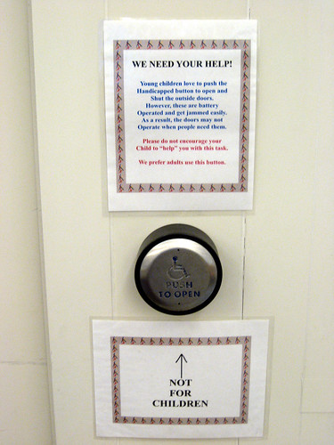
These are the signs next to the button that automatically opens the Library’s front doors, to provide easy entrance to people who have trouble opening the door.
As the comment mentioned, it of course is a great play thing for children. I don’t know how effective our signs are, but I have a feeling that the big arrow is probably irresistible to kids – even those who can’t read.
But I think signs, in general, are band-aids, and a real solution (or the real problem) lies in the very design. I don’t know how this could be designed differently, but there’s got to be a more effective approach to the situation.
http://www.swissarmylibrarian.net/2008/08/07/button-not-for-children

